Friday, March 30, 2012

Fun & Frivolity

Two of my kids are in Easter Bonnet Parades at school tomorrow, they have been practising their songs and dance steps for weeks now and are just so excited. . . and today the eldest of the two asked that I make her a bonnet so that she wouldn't have to wear "plain old bunny ears" as if they were donated by the Easter Bunny himself!

Of course because Miss Seven wanted a bonnet, Miss Five needed one too!  So I was given pictures of what the end product should look like and the colours to be used. 


Luckily I picked a number of flowers that both girls could assist with - the origami tiger lilies and the rosette flowers were easy for them to fold.  I then involved them with gluing and glittering - of course there cannot be enough of that particular product and you will be delighted to know that the dining table is covered in Dazzling Diamonds. 


Thank goodness for the Sizzix Flower Folds die which worked a treat.  A few pieces of Kaleidoscope designer series paper from two seasons ago and the projects have more joins than the Sydney Harbour Bridge.


I usually make the origami lilies in topiary balls and can now tell class attendees that they are child's play - Miss Seven and Miss Five had no trouble at all with the simple fold and staple project.

Hip love
Shanni

Thursday, March 29, 2012

Convention Creeping Up!

It's so exciting, Canberra Convention is just 63 sleeps away and the Australian capital will host hundreds of mad stampers and scrap bookers. . . There are about ten of us heading south for the big event which promises to have all the glitz and glamour of a Hollywood awards night!

I have been working on swaps - they feel a bit like they are never ending. . .

Here are two more that I have come up with:


En Francais, Creative Elements and a sweet combination of colours - Bravo Burgandy, Baja Breeze and River Rock on Very Vanilla card stock mounted on Basic Black card stock.


Lovely as a Tree, the words from Contempo Christmas stamped in Always Artichoke and Pear Pizzazz on Whisper White and mounted with Pear Pizzazz in between the base and the top card are the basis for this simple card.

I am still on track for my goal of 500 and I would love to have them completed by Easter. . .

Having fun
Shanni

Wednesday, March 28, 2012

Bits 'n Pieces

Some stamping chicks got together last night for a paper crafting session.  I have been sorting through my left over bits and pieces and made two cards. . . I love it when you can combine several scraps and come up with a nice project.

Reduce, reuse, recycle is my motto.


This is a card that I made using Summer Solstice and En Francais.  I love the combination of Early Espresso, Cherry Cobbler and Very Vanilla.  The flower in the centre was embossed using black embossing powder and coloured using Cherry Cobbler and Old Olive Stampin' Write markers - the flower looks a little darker than I expected.  I haven't put a greeting on the card as I will choose that closer to the time of giving it away but it will go in the bottom right hand corner to balance the layout.

Next card is a combo of products - I had some pieces left over from a class that I attended and I wanted to put them to good use rather than toss them out.  I think it will be a "sweet friend" card at the end of the day that I will send to one of my friends to let them know that they are in my thoughts. . .


En Francais and the Medallion background stamps have been combined to build the background of this card.  The colour scheme is Baja Breeze, Very Vanilla and Soft Suede for shading.  I have also used a mannequin die cut which I stamped with a flourish in Staz On Black ink, then texturised with a flourish embossing folder then daubed and made untidy so that it has an antique feel to it.  I wrapped lace around the waist, used crackle medium on the bodice and attached a fleurette with pearl centre brad as the finishing touches. . . Not too shabby!

Until next time
Shanni 

Team Swaps - March Meet

We had a dozen girls attend our Quarterly Get Together this month - it was nice to catch up with everyone. I said that I would upload a picture of all the swaps for the "metallic" theme, so here they are:


So starting at the rear left hand side - Coral has made an amazing flower on an embossed calendar which she daubed with Platinum Shimmer Paint (the centre of the flower is Champagne Chunky Glass Glitter and the feature butterfly is made with the Sizzix Beautiful Wings Embosslit Die); Jessica has embossed on Night of Navy card stock in silver embossing powder and then stamped in Not quite Navy on white card stock - with a cute little silver brad holding the arrows in place; Jodie has stamped the Best Dad Ever ties in Lucky Limeade and Basic Gray and made a feature tie and diamante pin with the brushed silver card stock.

Middle row starting at left hand side - Shanni has stamped Fabulous Floret silhouette flower stamp in Basic Gray and Platinum Shimmer Paint on white card stock and accented the image with aluminium foil on card stock embossed using the Stripes Embossing folder; Cheere has created a corrugated effect which she has daubed with black and Platinum Shimmer Paint, silver brads feature in each corner of the mount card and centres of the tiny red flowers that she has created using the Boho Blossom Punch and Real Red card stock. The Little Leaves sizzlet was used to make the leaves; Jenny has used the Elegant Bouquet embossing folder to form the background impression on her card,  She has stamped and coloured the flower from the Every Moment set and painted it lightly with the Champagne Shimmer Paint; Paula has embossed Basic Gray card stock using the Flower Garden Embossing folder, then daubed the whole impression with Frost White Shimmer Paint.

Front row left hand side - Sandra has created two wrenches using the 1 1/4" Circle Punch, Small Tag Punch and 1/2" circle punch.  She has mounted the tools on an aluminium foil back ground glued to card stock which was embossed using the Hounds Tooth Embossing folder; Liz has created the Sweet Friend card using the You Are Loved set.  The heart was embossed using silver embossing powder on Pretty in Pink card stock which has been cut out and dimensionalised on Velum card stock stamped using the rose stamp from the same set in Staz On White ink and run through the shottie with the Top Note Die.  The background card stock was embossed using the Polka Dots embossing folder and the Scallop Trim Border punch was used on the Rose Red card stock as a feature with the Brushed Silver card stock on the right hand side of the card.  Two little brads secure the banner "Thinking of You" across the heart.

Great work everyone!  Next swap theme is Childish Birthdays. . .

Shanni

Monday, March 26, 2012

Make it Monday

I love the rain. . . but we have had so much lately that I am beginning to question my sanity. . . but when the weather is so wet there is little excuse not to craft!

My favourite colour is black (although it is not a colour) and I love to create cards which are simple and clean in their contrast.  So this colour combination suits me down to the ground.


This is a newspaper inspired card ie black and white.  I have cheated by stamping the leaves from French Foliage randomly on Whisper White card stock then punched the images out with the 1 3/8 square punch, daubed the edges for a bit of depth and to make them pop off the white back ground and mounted the base card on Basic Black card stock.  I have then mounted the whole thing onto a Whisper White card base.

Simple but effective. . . no excuses now. . . have to tackle the washing.

Until next time
Shanni 

Sunday, March 25, 2012

March Quarter Team Get Together

The Paper Belles have had a huge year - we have over 20 new members and have accomplished heaps of milestones in the past twelve months.  The Stampin' Up! year runs from 1 April - 31 March and is about to come to another close.

Today I am hosting my Team's Quarterly Get Together.  We generally have two gatherings a month to focus on different things and I hold a quarterly get together for those who live at a distance or who due to work and life commitments are not able to make it at other times.

We exchange swaps, have a chat and a drink of some nature - and there is always food - and I like to do a little project to show different techniques, styles and colours. 

The project I have created for today uses the French Foliage set.  I love trees and leaves and branches so these "nature" sets get extra work outs in my house!  I used every stamp in the set on this card and am quite happy with the outcome. I hope that gang likes it and that it prompts other ideas for everyone.


My colour scheme is Cajun Craze, River Rock and Very Vanilla card stocks and I have used these colours to stamp (excluding the vanilla of course). I have also incorporated Well Worn designer Series Paper.  The embellishments are natural hemp twine and the safety pin from Vintage Trinkets.

I gave the card texture using the Square Lattice embossing folder with the shottie.  And of course I couldn't resist distressing and daubing the edges using Early Espresso ink. 

Because the Well Worn DSP is so versatile and beautiful I had to use several pieces of it and made the exact same layout with three other prints from the set.  They all look slightly different of course but the overall flavour is masculine!


Got some great swaps too - will take some photos and upload them soon.

Hip love
Shanni

Tuesday, March 20, 2012

Productive day crafting because it is still raining. . .

Got together with my Tuesday crafting friends today and had a productive time - got another 50 Convention swaps underway and also made some other cards because the mojo was in 6th gear!

So here is a card that I have made for a friend who is moving away soon and will be in my thoughts often. She and I both like the vintage themed cards so thought that I would try out a stamp set that most people think is only for Valentine's Day - the You Are Loved set from the Summer Mini which will not be available after 31 March. . .


The card is a 6 x 6 square and nice and heavy (thank goodness I am giving it away and not posting it!).  I have used some of my favourite colour combos - Early Espresso, Cherry Cobbler and Always Artichoke.  The daubing on the edges was done with Soft Suede ink.

I used the Music Notes Stampin' Around wheel  for the top of the card, stamped the En Francais background stamp on an angle 2/3rds of the way across the card; I stamped off the ink first.  I distressed and daubed the edges and then sprayed the whole base card with Champagne Shimmer Paint diluted with Isocol alcohol.  I mounted this base on Cherry Cobbler card stock (which I had distressed and daubed with Soft Suede). Then mounted both onto the Early Espresso card base.

The small rose stamp in the You Are Loved set is beautiful.  I inked it up with Stampin' Write Markers, stamped them on scraps of Very Vanilla and then cut them out and stuck them strategically.  The lace doillie at he back was dirtied up with soft suede ink, using a dauber.  I purchase my doillies at second hand shops whenever I see them as they come in handy for cards and scrapping pages.  I needed to stick this down with sticky strip to make sure that the fabric secures well to the card.


I then punched eleven Fancy Flower shapes out of Cherry Cobbler card stock, distressed the card stock, daubed them with Soft Suede and twisted them into roses using Tom Bow glue (you can see in the centre of the top one that the glue hasn't quite dried. The largest rose uses four punches, the smaller three punches, next size down two punches and then the two buds only use one punch each.


I mounted the roses using dimensionals and inserted Sizzix Little Leaves that I cut out using Always Artichoke card stock - I basically poke these in where needed to balance the arrangement.  Finally I sprayed the whole card with the Champagne Shimmer Paint solution and added the little pearls in diagonal corners. The sentiment comes from the You Are Loved set too.

Love 'n hugs
Shanni

I have some creative elements. . .

Rain has lessened today and the skies are clearing so it must be a sign that the big wet is retreating.  I have been trying to come up with some ideas for swaps for Convention because I go insane making a huge number of the same one. . .

I decided to use Creative Elements and to combine a heap of the stamps from the set in a random fashion.  To add a further challenge to the project I also selected a "creative combination" of colours - these are colours that you wouldn't necessarily put together but when you do they work!  So the combo is Soft Suede, Pretty in Pink and Certainly Celery.

Pretty in Pink is the base card, mounted with Soft Suede (10cm x 14.3cm) and the stamped background is on Very Vanilla. 


Of course I felt like it needed something more so I included the En Francais stamp in the background
added some pink flowers with the mid sized flower from Language of Friendship (inked up using a Stampin' write Marker) and using a frame from the Stampin' Up! Four Frames Sizzlet pack I mounted the sentiment which came from the Sale-a-Bration Elementary Elegance set.

Distressing, tearing and daubing softened the whole effect and the little bit of ribbon is to balance the design - nice and easy and quite pleasing to the eye.

72 sleeps until Convention. . .
Shanni

Sunday, March 18, 2012

Beau Chateau Trinket Box

Loving the rain as it means that I have no reason to not be crafting. . .

I decided to recycle a King Island cheese box today by covering it with some Beau Chateau designer series paper and then building some roses for the top of it.  This is such an easy but effective project.


Basically I trace the box and lid that I am covering being sure to add an additional 1 cm around the circumference to draw over the lip and give the project a "finished" look.  This is easy to do if you use a Stampin' Up!Circle Scissors tool.  Next I stuck the paper to the actual project using Tom Bow multipurpose glue. Then I snipped the overlap around the box and glued the lip down using Tom Bow.

To cover the pleated appearance of the paper cover I chose to stick a card stock collar around the perimeter of the lid and base.  I stuck this down using Stampin' Up! sticky strip (I think it is stronger than a welding joint!).  I then covered this with a piece of Pink Pirouette satin ribbon and tied a standard reef knot so that it sits nice and flush to the lid.


Next I cut some Sizzlet Little Leaves using the Shottie in Soft Suede card stock and 10 of the smaller flowers from the Blossom Party die in Pink Pirouette card stock and folded them into roses.  I stuck the leaves down once I had creased the centres with snail adhesive and attached the flowers using dimensionals.


For the final touch I sprayed the whole project with some Frost White Shimmer Mist and Pretty in Pink re-inker that I had thinned down with Isocol alcohol for a beautiful pink shimmer effect. . . I added a few drops of Crystal Effects to appear like moisture on the petals and added a few pearls for the same effect on the paper background.

Not bad. . .
Shanni

Wednesday, March 14, 2012

Guest Feature on Creating Your Way to Success

This week I am being featured on Creating Success a really exciting blog created by a friend of mine who lives life everyday with the same zest and energy most of us reserve for special events (or marathons).  Anyway the talented Jill has asked me to answer some questions:

What do you create?
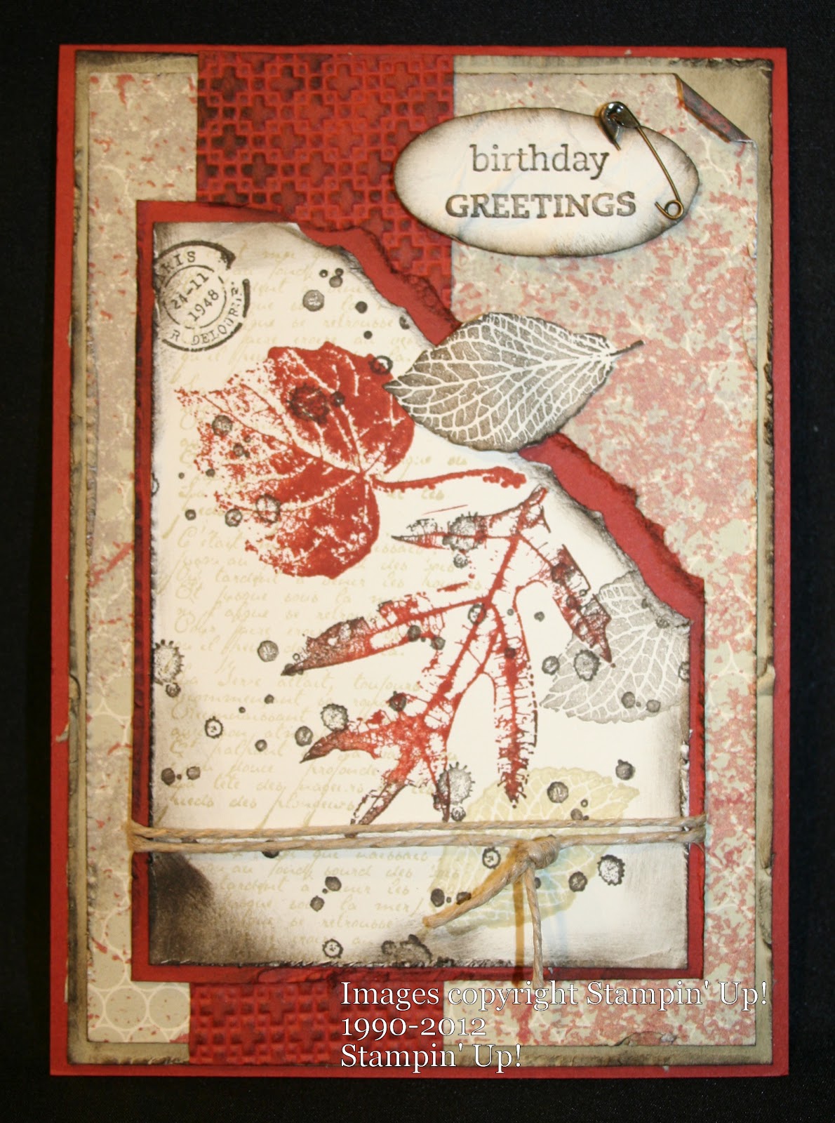
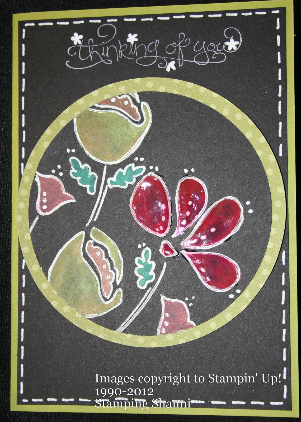
I have always done some form of art and craft, I paint in a modern bold colour style, love folk art (especially when someone actually needs a piece), watercolour landscapes but the thing that I keep coming back to time and time again is paper crafting, especially stamping and off the page projects. I make cards for all occasions and invitations and other paper projects that are practical.


Why do you create?
I create because I feel like a part of me is missing if I don't.  I find that when I am creating, I truly relax which is not something that I do even when I am sleeping. . .I actually feel more rested after making a set of cards or a journal like the one above than I do after four hours sleep a night.  I suppose I should take this to the next level and answer why I create with rubber, ink and card stock. . .  As a kid I loved shopping for stationery at the beginning of the school year.  I still have a stash of writing paper and pens that I can't live without (asides from my crafting stash).  I simply love the texture, smell, colour and impact of papers and colour.


Do you sell your creations?
I don't sell my creations per se, I generally give them away to friends and family but I hold classes and sell card and project kits.  I also sell all of the products that I use for the creations through my Stampin' Up! demonstratorship. It's hard to say if I make any money from selling - how do you cost out time, creativity and imagination? The value to me is seeing other people learn skills they didn't think they could master and seeing them reproduce the designs and layouts that I come up with time and time again.


What mistakes have I made or what lessons have I learned?
I have learned to trust my instincts more when it comes to creative trends, colours and projects.  The only mistake I think that I made was not signing up for my own Stampin' Up! account soon enough.  Being able to buy direct from the company at a substantial discount is a great saving and would have kept my accountant husband happier earlier lol. But the true beauty of working with stamps, ink and cardstock is that you can always turn the card over and start again - it's not a major crisis!


What to you is success?
Success means many things to me.  Success is looking at a completed project knowing that it is the best I can do at that point in time.  Success is watching people emboss an image, tie a perfect bow, make a stunning flower, stamp confidently or progress to their own designs with determination.  Success is having team members get promoted, repeat something that I have said to them and truly understand and believe what I meant.  Success is having time with my kids, watching them grow and achieve everyday.  Success is that piece of string that we all hear about and my being confident that I know how long it is and where it ends. . .


So whats next?
South Pacific Convention in Canberra in May. . . Another ten people joining my team of passionate stampers and scrappers (contact me today if you are interested).  Making myself use more fabric in projects - Stampin' Up! have some beautiful materials which match their designer series papers and stamp sets perfectly. But in reality, what's next is the next project, the next card, the next inspiring image or colour combination that just won't leave my creative muse alone.

Thanks for hosting me
Shanni


Tuesday, March 13, 2012

Cards for the Lads

Now that I have started stamping with The Open Sea, I can't seem to stop trying it on different projects. . . here are some more that I have pulled together today whilst crafting with some friends.


So the base card is a piece of A5 Crumb Cake cardstock daubed with Early Espresso.  I have mounted the base card with a piece of Not Quite Navy 10cm x 14.3cm.  The Vanilla card stock mounted on that mat was stamped using the ledger stamp from The Open Sea set in Crumb Cake and the anchor in stamped off Early Espresso.  Compass was stamped in stamped off Not Quite Navy.  Mis-treated it a bit with tearing, distressing and daubing. 

On a piece of scrap vanilla I stamped the ship in Early Espresso, tore it to the appropriate size and daubed the edges and the ocean with Not Quite Navy ink.  Distressed and rolled the edges and mounted it with dimensionals.

I used a similar approach for the sentiment but stuck it flat to the base.  The anchor image is dimensionalised as well.  Had some left over build-a-brads so I stamped the compass, coloured it with an aqua pen and some Not Quite Navy ink then punched it out to be the feature on the brad.  


This card was made in an almost identical fashion except of course the base card is Cherry Cobbler and the mounting card is Basic Grey.  I also included the Nautical Expedition designer series paper as I love the globe map images.  Distressing and daubing seems to be the technique of the day.  The "Celebrate Today" comes from the Perfectly Penned set and is great for man-cards!


This card was made with the same colour scheme as the one above.  I have added some Early Espresso Baker's Twine and Crystal Effects to the anchor and sentiment to get them to pop a little.

A productive day all round.

Ahoy!
Shanni


Monday, March 12, 2012

The Open Sea

A wet and rainy day here in Cairns prompted me to make a blue toned card using The Open Sea which is featured in the Summer Mini finishing on 31 March.  Thought I had better post an example before the end of the month if people were looking for ideas. . .


And fortunately for me, I finished it in time to upload to Make It Monday's linky party. 

Always difficult to come up with truly masculine cards.  The colour selection was the easy part - Crumb Cake, Not Quite Navy and the neutral tones of vanilla .  I put crystal effects on the stamped images that I wanted to pop and to add some more texture to the design. 

I like to scrunch, daub and distress for the blokes - a bit of untidiness is always appealing and the odd tear never goes astray either.

This is such a versatile stamp set - great for scrapping and card making.  There are a number of stamps which can be features or background images; stamping them off and having a lighter tone for larger areas is also a great technique.

Will challenge myself to make a few more cards utilising this set over the next two weeks so stay tuned.

Hip love
Shanni

Sunday, March 11, 2012

Productive Day with Crafty Mates

Had a lovely day with friends at Scrap Therapy in misty Babinda.  I love spending time with friends, creating and sharing ideas and suggestions.  When you spend time with friends who are like minded it is very simple to get those cretive juices flowing.

Lee-Anne and Danny let us paw through their virtual treasure chest of products and new tools. . . wow! I felt like a little kid on Christmas morning.  Consequently spent more time treasure hunting than creating but still managed to produce a few projects. . .


Gotta love French Foliage - it seems to go with everything! Snuck in Love & Care too - I so like those flowers to brighten up any project.

Yummo!


For some different colour combinations Island Indigo and Elegant Eggplant all tied together with a bit of Early Espresso.

Enjoy!
Shanni


Friday, March 9, 2012

Vintage Cards

Here are two more cards that I have made in recent times.  I lean towards the vintage style for a number of reasons - it is not essential to stamp perfectly every time, it is easier to hide flaws and mistakes and there is also an appeal about the cards that makes them feel more substantial.  It could be because the layering in vintage layouts appeal to me, but I also like the colour schemes that you can incorporate.

This card is a 6 x 6 size and uses Baja Breeze and Soft Suede as it's card base.  I also love the blue vintage background mounted on the Soft Suede which is from Pocketful of Posies DSP.  I stamped the card in Soft Suede behind the main feature using the Parlor Prints background stamp. 

All the flowers are hand made using the scallop circle punch and the Island Floral Big Shot die and the middle-sized flower from  the Boho Blossoms punch.  I stamped the mannequin image on white card stock and ran it through the Big Shot using the oval Designer Frame frame embossing folder and mounted it on Ovals original die.  All the edges were made a little untidy and daubed with Soft Suede and a dauber.  Curled a few pieces of scrap card stock as the leaves, sprayed it with Frost White Shimmer Mist coloured with Baja Breeze ink refill and that's it!


This card is in the vintage style again but with a neutrals colour scheme.  I used Cherry Cobbler to break it up a bit.  Once again a 6 x 6, Cherry Cobbler base, Crumb Cake mount (stamped randomly with the smaller flower from Vintage Vogue Set) and then stamped on Very Vanilla using Crumb Cake ink with En Francais background, stamped random vine images from the Vintage Vogue set with Early Espresso and distressed the edges and daubed with Early Espresso. I stamped the other flowers on vanilla card stock in Cherry Cobbler and cut them out for mounting.

The Friends stamp from Vintage Vogue was stamped on vanilla card stock and cut out using the Big Shot and circle Die.  Also cut a larger circle in Early Espresso once again using the shottie.  Mounted the flowers in a falling fashion using dimensionals.

Turned out quite well - proof that you can use different colours, using the same style and come up with different feels in the same theme.

Sharing the love
Shanni


Wednesday, March 7, 2012

Awash with Flowers - PC - Colouring Outline Inked Images

The final three cards that I made using this set this week employed the same colour scheme of Rose Red, Not Quite Navy and River Rock.  I wanted to see how different the cards would look by varying the technique slightly.

Firstly I coloured the outlined image in using Stampin' Write Markers and blender pens.  I am quite happy with the result.

The next card I stamped the petal card in a mirror image of itself on white card stock and made three separate flowers.  I coloured these in using an aqua pen and ink pad, I layered the colour to give depth and dimension to the petals.  I stamped the leaves on River Rock card stock and coloured them in with Not Quite Navy ink.  I then stuck the flowers and leaves to the base, placed little 1/2 inch circle punch centres in Rose Red to the middle of each flower and embossed the piece using the Sizzix Square Lattice embossing folder. This gives a great effect - I call it the kitchen towel embossing folder as the texture reminds me of paper towels.


I was surprised at how nice this sweet colour combination worked.  Gotta love the Stampin' Up! Colour Coach - the best little investment you can make to ensure that colour schemes are easy on the eye.

The final card that I made this week with the Awash with Flowers was very simple.  I stamped the petals image in a mirrored fashion on white card stock as per the above card, coloured them in using an aqua pen and Rose Red ink pad.  I stamped the leaves outline on River Rock and coloured them with Not Quite Navy.  I cut the flowers and leaves out and mounted them on the card base around the greeting banner.  I used a button in the centres of the flowers (this is because the outlines overlap and don't look that great) and sprayed the whole project with Frost White Shimmer Paint spritzer.


Enjoy!
Shanni

Awash with Flowers - PC - Using the Large Petal Stamp Only

The Awash with Flowers is a two step stampin set.  Stampin' Up! were the first stamping company to come up with the concept of two step stamping.  For those who are a little confused by what this refers to it is quite simple.  One stamp is a solid image and the second stamp (which is stamped over the top of the first stamped image) is the outline or the detail; in order to have a complete image you need to stamp with both stamps and there are two steps.

Here is a card using the two steps.  I have used a creative colour combination of More Mustard, Elegant Eggplant and Garden Green - I was trying to work out how to bring more Elegant Eggplant into the card but decided that I liked in "clean".


The beauty of this stamp set is that you can colour the outlined stamp images in many ways and each time it results in a unique image. 

On this next card I have coloured in the petals using an aqua pen and ink pad.  I ahve tried to layer the colour so that it adds depth to the image.  Once again I forced myself to use pink - you aren't going to believe me when I tell you it's not my favourite colour are you?


I incorporated the I (Love) Love jumbo wheel on this card as I felt the background needed something to break the solid colour. I stamped pink on pink.  The leaves are of course the beautiful Sizzlets Little Leaves which I use on nearly every flower card I make.  The creative colour scheme is Melon Mambo, Old Olive and Elegant Eggplant.  I have stuck the Melon Mambo grosgrain ribbon upside down to hide the white polka dots.

Cheers
Shannean

Awash with Flowers - PC - Black Board Stamping

The next technique that I tried was not as successful for me as I would have hoped.  People like Sandi McIver make this technique look simple but in reality it is hard to get the colours even.  In fact Mette, one of my stamping partners in crime, does amazing black board work. . . I have discovered that you also need a very steady hand to make the outline look like white chalk on a black board.  Hats off to black board artists all over the world!

So this first card is stamped first with craft white direct onto black card stock, I have then coloured over the white (once it was dry) with Stampin' Up! watercolour pencils. I then merged the colours with an aqua pen and outlined with a white gel pen.  I wasn't happy with how dull the red looked so I crystal effected it. . . not my best effort but I want people to see the projects warts and all!

This card is almost the same technique as the one above, but I didn't try to merge the watercolours here - I avoided the aqua painter and think that the colours are less patchy.

The third card using this technique was coloured with Stampin' Crayons instead of Watercolour Pencils and the colours are very vibrant. The greeting is from the Elementary Elegance set from Sale-a-Brations and complemented the fine lines of the Awash with Flowers outline stamps.

So I hope that you found some black boarding mojo from the above examples and that you forgive me because they are not the best examples in the world. 

Sharing is caring
Shanni

Awash with Flowers - PC - Outline Stamping & Daubed Colour

Sometimes I like to challenge myself to sit with a stamp set and make ten cards before I am allowed to move on to my next projects. . . This week's PC - personal challenge - was Stampin' Up! Awash with Flowers.  The set is a two step stampin' set and has plenty of images to choose from and although I have owned it for a year now it only gets used for random projects. 

I have come up with ten designs.  All cards are made in the A5/C6 size which means that they are all 10.5 cm x 14.8 cm.  I like to mount my image stamped cards and there is a fair bit of weight in them. This week I also chose to use colours outside my comfort zone.  I really have to push myself to use pink and have to remind myself that whilst it is not my favourite colour, it is a lot of other people's favourite colour. . .

So first challenge - stamping outline and colouring with a dauber - here are two different colour schemes for the same technique and are good examples on how vastly different projects can look by simply changing colour combinations.  I stamped the background randomly in black ink then daubed in the colours.


Colour scheme - Melon Mambo, Regal Rose, Calypso Coral and Pear Pizzazz.  Background colour - So Saffron.  Remember to always stamp off the inked dauber first so that you don't end up with blotchy colour spots.


These colours were easier for me to work with - sweet set Blushing Bride, Perfect Plum and River Rock.  I also added Pear Pizzazz for the leaves.  The background colour is River Rock as well.  I embossed the Blushing Bride card on the front with the Sizzix Big Shot Elegant Bouquet embossing folder to fit in with the spray of flowers theme.

Back soon with the next PC. . .black boarding.
Shanni

Tuesday, March 6, 2012

Simply Adorned No More. . .

Sad news today. . .Stampin' Up! are discontinuing the Simply Adorned line as of the end of this month.  If you love these little trinkets, charms and baubles then you need to get in and purchase them as soon as possible.  They will not be replenished if they are sold out before 31 March. 

The Simply Adorned trinkets can be found on page 7 of the Summer Mini. They are stunning in real life and are great little add ons for any special occasion card or scrap page.  They are also great jewellery accessories - jewellery grade nickle and hard wearing.

Check out one of my creations using the 1.6cm square charm.  Once again using the Fabulous Florets stamp set and words from the Sale-a-Brations Elementary Elegance set.


They are beautiful in their own right and quite versatile.

Hip love
Shanni

Monday, March 5, 2012

Canberra Here We Come. . .

87 days to go. . . until Canberra Convention and I have only just started looking at swaps for the big event.  I have started out simply as I would like to try and do 500.  Swapping is the best method of meeting people and getting new ideas.  I always try to do cards that are a bit unusual and this year will be no different.

My first swap for Convention 2012 is a black and white number (which really doesn't come up very well in the photo).  It is stamped in Staz On jet black and sprayed with Frost White Shimmer Paint spritzer and Dazzling Diamonds has been applied to the flower petals.  In real life it is quite pretty.


The second is equally simplistic - I just love the Fabulous Florets set from the Summer Mini and have almost burnt the rubber I have used it so much. I have masked and stamped the oleander out of this set and then popped a couple on dimensionals. The whole card was misted with Frost White Shimmer Paint spritzer to give it a pearl shimmer.


So I have three other styles in mind and will keep you updated on progress.

Back later
Shanni


Beau Chateau Designer Series Paper Projects

I have a regular group of stamping friends who meet at my place on Tuesday nights and of course our friendships have grown over the years to the point where we give each other gifts and look for any excuse to have a little party.  Christmas was postponed this year due to a bout of gastro so we ended up celebrating in February.

This was the gift that I made for the lovely Helen who is one of the sweetest people you could ever meet, she is also very talented stamper so I was a bit nervous about whether she would like her pressie.


For a closer look at the notebook


And also the post it note booklet


Gotta love the Champagne Mist Shimmer paint spritzer! 

Hip love
Shanni